

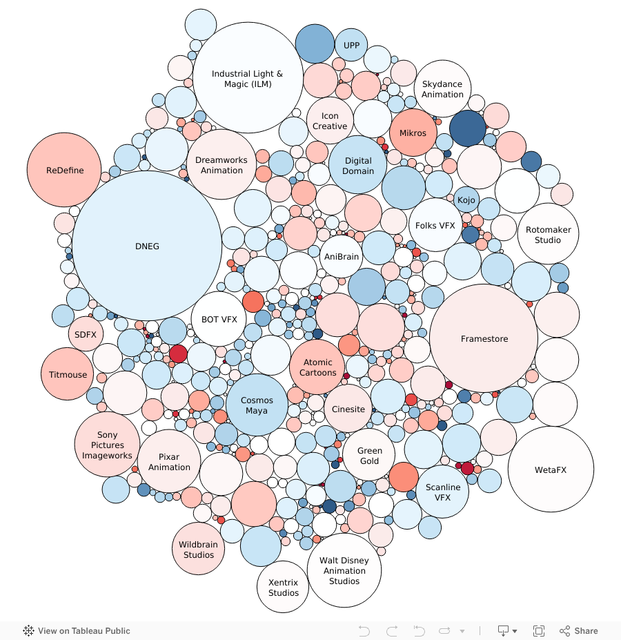
This chart shows approximate size and change in headcount for 500 companies in our study from March 2025 to June 2025. The colors represent whether a company's headcount has grown or shrunk over the previous six months: blue indicates growth, while red indicates a reduction in headcount. The darker the color, the greater the change. As we are looking at percentage change relative to the company's overall size, smaller companies tend towards darker colors.